Несколько примеров как изменить внешний вид чекбоксов с помощью CSS, изображений и немного JS.
<label> и помещенного в него инпута, т.е. по клику на него, инпут будет менять свое состояние. <label>
<input type="checkbox">
Checkbox
</label>Стоит заменить что в некоторых старых браузерах (например Safari) такой приём не работает и требует добавление атрибутов for у <label> и id у чекбокса.
<label for="element">
	<input type="checkbox" id="element">
	Checkbox
</label>В зависимости от состояния чекбокса :checked, :disabled и :focus, следующему за ним элементу, например <span>, можно задавать стили с помощью селектора «+».
<label>
	<input type="checkbox">
	<span>Checkbox</span>
</label>/* Dafault */
label input[type=checkbox] + span {
...
}
/* Focus */
label input[type=checkbox]:focus + span {
...
}
/* Checked */
label input[type=checkbox]:checked + span {
...
}
/* Disabled */
label input[type=checkbox]:disabled + span {
...
}
label input[type=checkbox]:disabled:checked + span {
...
}Сам чекбокс скрывается, но без использования display: none, что бы оставить функциональность фокуса.
label input[type=checkbox] {
	position: absolute;
	z-index: -1;
	opacity: 0;
	display: block;
	width: 0;
	height: 0;
}По умолчанию, фокус появляется при клике на элемент, что не очень и нужно. Оставить выделение при фокусе только при нажатии клавиши Tab можно с помощью JQuery, добавляя класс focused родительскому элементу.
$(window).keyup(function(e){
	var target = $('label input[type=checkbox]:focus');
	if (e.keyCode == 9 && $(target).length){
		$(target).parent().addClass('focused');
	}
});

$('label input[type=checkbox]').focusout(function(){
	$(this).parent().removeClass('focused');
});Пример №1
В первом примере понадобятся два изображения (обычный и отмеченный), для ускорения прорисовки можно использовать спрайты, но тогда не сделать плавную смену при переключении (transition background).
checkbox-1.png

checkbox-2.png

HTML-разметка:
<label class="checkbox-other">
	<input type="checkbox" checked>
	<span>Checkbox #1</span>
</label>

<label class="checkbox-other">
	<input type="checkbox">
	<span>Checkbox #2</span>
</label>

<label class="checkbox-other">
	<input type="checkbox" disabled>
	<span>Checkbox #3</span>
</label>

<label class="checkbox-other">
	<input type="checkbox" checked disabled>
	<span>Checkbox #4</span>
</label>Фокус по клавише Tab:
$(window).keyup(function(e){
	var target = $('.checkbox-other input:focus');
	if (e.keyCode == 9 && $(target).length){
		$(target).parent().addClass('focused');
	}
});

$('.checkbox-other input').focusout(function(){
	$(this).parent().removeClass('focused');
});CSS-стили:
.checkbox-other {
	display: block;
	margin: 0 0 10px 0;
	cursor: pointer;
	user-select: none;
	position: relative;
}
.checkbox-other input[type=checkbox] {
	position: absolute;
	z-index: -1;
	opacity: 0;
	display: block;
	width: 0;
	height: 0;
}
.checkbox-other span {
	display: inline-block;
	position: relative;
	padding: 0 0 0 35px;
	line-height: 22px;
}
.checkbox-other span:before {
	content: "";
	display: inline-block;
	width: 22px;
	height: 22px;
	position: absolute;
	left: 0;
	top: 0;
	transition: background 0.3s ease;
	background: url(/checkbox-1.png) 0 0 no-repeat;
}

/* Checked */
.checkbox-other input[type=checkbox]:checked + span:before {
	background-image: url(/checkbox-2.png);
}

/* Focus */
.focused span:before {
	box-shadow: 0 0 0 0.2rem rgba(0,123,255,.25);
}

/* Hover */
.checkbox-other span:hover:before {
	filter: brightness(110%);
}

/* Active */
.checkbox-other span:active:before {
	filter: brightness(80%);
}

/* Disabled */
.checkbox-other input[type=checkbox]:disabled + span {
	color: #666;
	cursor: default;
}
.checkbox-other input[type=checkbox]:disabled + span:before {
	filter: grayscale(100%);
	opacity: 0.6;
}Результат:
Пример №2
Подходит для случаев, когда галка выходит за края элемента. HTML-разметка и JS-код остается прежними.
checkbox-3.png

checkbox-4.png

.checkbox-other {
	display: block;
	margin: 0 0 10px 0;
	cursor: pointer;
	user-select: none;
	position: relative;
}
.checkbox-other input[type=checkbox] {
	position: absolute;
	z-index: -1;
	opacity: 0;
	display: block;
	width: 0;
	height: 0;
}
.checkbox-other span {
	display: inline-block;
	position: relative;
	padding: 0 0 0 35px;
	line-height: 22px;
}
.checkbox-other span:before {
	content: "";
	display: inline-block;
	width: 22px;
	height: 22px;
	position: absolute;
	left: 0;
	top: 0;
	background: url(/checkbox-3.png) 0 0 no-repeat;
}

/* Checked */
.checkbox-other input[type=checkbox] + span:after {
	content: "";
	opacity: 0;
	transition: opacity 0.3s ease;
}
.checkbox-other input[type=checkbox]:checked + span:after {
	display: inline-block;
	width: 22px;
	height: 22px;
	position: absolute;
	left: 4px;
	top: -5px;
	background: url(/checkbox-4.png) 0 0 no-repeat;
	opacity: 1;
}

/* Focus */
.focused span:before {
	box-shadow: 0 0 0 0.2rem rgba(0,123,255,.25);
}

/* Hover */
.checkbox-other span:hover:after {
	filter: brightness(110%);
}

/* Active */
.checkbox-other span:active:before,
.checkbox-other span:active:after {
	filter: brightness(80%);
}

/* Disabled */
.checkbox-other input[type=checkbox]:disabled + span {
	color: #666;
	cursor: default;
}
.checkbox-other input[type=checkbox]:disabled + span:before,
.checkbox-other input[type=checkbox]:disabled + span:after {
	filter: grayscale(100%);
	opacity: 0.6;
}Результат:
Пример №3
Вариант с использованием символа галочки – ✓ или эмоджи ✔.
.checkbox-other {
	display: block;
	margin: 0 0 10px 0;
	line-height: 22px;
	cursor: pointer;
	user-select: none;
	position: relative;
}
.checkbox-other input[type=checkbox] {
	position: absolute;
	z-index: -1;
	opacity: 0;
	display: block;
	width: 0;
	height: 0;
}
.checkbox-other span {
	display: inline-block;
	position: relative;
	padding: 0 0 0 35px;
	line-height: 22px;
}
.checkbox-other span:before {
	content: "";
	display: inline-block;
	width: 20px;
	height: 20px;
	position: absolute;
	left: 0;
	top: 0;
	border: 1px solid #2B7335;
	box-shadow: inset 0 0 3px #8a8a8a;
}

/* Checked */
.checkbox-other input[type=checkbox] + span:after {
	content: "";
	opacity: 0;
	transition: opacity 0.3s ease;
}
.checkbox-other input[type=checkbox]:checked + span:after {
	content: "✓";
	color: green;
	font-size: 30px;
	font-weight: 900;
	position: absolute;
	left: 2px;
	top: -2px;
	opacity: 1;
}

/* Focus */
.focused span:before {
	box-shadow: 0 0 0 0.2rem rgba(0,123,255,.25);
}

/* Hover */
.checkbox-other span:hover:after {
	filter: brightness(110%);
}

/* Active */
.checkbox-other span:active:before,
.checkbox-other span:active:after {
	filter: brightness(80%);
}

/* Disabled */
.checkbox-other input[type=checkbox]:disabled + span {
	color: #666;
	cursor: default;
}
.checkbox-other input[type=checkbox]:disabled + span:before,
.checkbox-other input[type=checkbox]:disabled + span:after {
	filter: grayscale(100%);
	opacity: 0.6;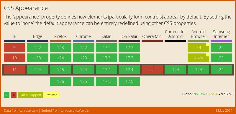
}Пока нестандартезированое свойство -webkit-appearance: none отключает стандартное оформление элемнта формы, но сохраняет его функциональность, тем самым появляется возможность задать ему любые стили, но без псевдосвойст :before и :after. Полное описание на developer.mozilla.org.
<label class="checkbox-other">
	<input type="checkbox" checked> Checkbox #1
</label>

<label class="checkbox-other">
	<input type="checkbox"> Checkbox #2
</label>

<label class="checkbox-other">
	<input type="checkbox" disabled> Checkbox #3
</label>

<label class="checkbox-other">
	<input type="checkbox" checked disabled> Checkbox #4
</label>.checkbox-other {
display: block;
margin: 0 0 10px 0;
line-height: 22px;
}
.checkbox-other input[type=checkbox] {
-webkit-appearance: none;
-moz-appearance: none;
display: inline-block;
width: 22px;
height: 22px;
margin: 0 5px 0 0;
padding: 0;
vertical-align: top;
outline: none;
transition: background 0.3s ease;
background: url(/checkbox-1.png) 0 0 no-repeat;
cursor: pointer;
}
/* Checked */
.checkbox-other input[type=checkbox]:checked {
background-image: url(/checkbox-2.png);
}
/* Focus */
.focused input[type=checkbox] {
box-shadow: 0 0 0 0.2rem rgba(0,123,255,.25);
}
/* Hover */
.checkbox-other input[type=checkbox]:hover {
filter: brightness(110%);
}
/* Active */
.checkbox-other input[type=checkbox]:active {
filter: brightness(80%);
}
/* Disabled */
.checkbox-other input[type=checkbox]:disabled {
color: #666;
cursor: default;
}
.checkbox-other input[type=checkbox]:disabled {
filter: grayscale(100%);
opacity: 0.6;
}Свойство appearance поддерживается всеми современными брузерами. В старых брауезерах, чекбокбокс будет выводится как обычный.