CSS стилизация чекбоксов по методу «Checkbox Hack» в виде переключателей (например, как в iOS, Google, Яндекс с их эфектами переключения).
Код JQuery используется только для сохранения у элемента функции фокуса при нажатии клавиши Tab.
HTML:
<label class="checkbox-green">
	<input type="checkbox">
	<span class="checkbox-green-switch" data-label-on="On" data-label-off="Off"></span>
</label>

<label class="checkbox-green">
	<input type="checkbox" checked>
	<span class="checkbox-green-switch" data-label-on="On" data-label-off="Off"></span>
</label>

<label class="checkbox-green">
	<input type="checkbox" disabled>
	<span class="checkbox-green-switch" data-label-on="On" data-label-off="Off"></span>
</label>

<label class="checkbox-green">
	<input type="checkbox" checked disabled>
	<span class="checkbox-green-switch" data-label-on="On" data-label-off="Off"></span>
</label>CSS:
.checkbox-green {
	display: inline-block;
	height: 28px;
	line-height: 28px;
	margin-right: 10px;
	position: relative;
	vertical-align: middle;
	font-size: 14px;
	user-select: none;
}
.checkbox-green .checkbox-green-switch {
	display: inline-block;
	height: 28px;
	width: 90px;
	box-sizing: border-box;
	position: relative;
	border-radius: 2px;
	background: #848484;
	transition: background-color 0.3s cubic-bezier(0, 1, 0.5, 1);
}
.checkbox-green .checkbox-green-switch:before {
	content: attr(data-label-on);
	display: inline-block;
	box-sizing: border-box;
	width: 45px;
	padding: 0 12px;
	position: absolute;
	top: 0;
	left: 45px;
	text-transform: uppercase;
	text-align: center;
	color: rgba(255, 255, 255, 0.5);
	font-size: 10px;
	line-height: 28px;
}
.checkbox-green .checkbox-green-switch:after {
	content: attr(data-label-off);
	display: inline-block;
	box-sizing: border-box;
	width: 44px;
	border-radius: 1px;
	position: absolute;
	top: 1px;
	left: 1px;
	z-index: 5;
	text-transform: uppercase;
	text-align: center;
	background: white;
	line-height: 26px;
	font-size: 10px;
	color: #777;
	transition: transform 0.3s cubic-bezier(0, 1, 0.5, 1);
}
.checkbox-green input[type="checkbox"] {
	display: block;
	width: 0;
	height: 0;
	position: absolute;
	z-index: -1;
	opacity: 0;
}
.checkbox-green input[type="checkbox"]:checked + .checkbox-green-switch {
	background-color: #70c767;
}
.checkbox-green input[type="checkbox"]:checked + .checkbox-green-switch:before {
	content: attr(data-label-off);
	left: 0;
}
.checkbox-green input[type="checkbox"]:checked + .checkbox-green-switch:after {
	content: attr(data-label-on);
	color: #4fb743;
	transform: translate3d(44px, 0, 0);
}

/* Hover */
.checkbox-green input[type="checkbox"]:not(:disabled) + .checkbox-green-switch:hover {
	cursor: pointer;
}
.checkbox-green input[type="checkbox"]:not(:disabled) + .checkbox-green-switch:hover:after {
	box-shadow: 0 3px 3px rgba(0, 0, 0, 0.4);
}

/* Disabled */
.checkbox-green input[type=checkbox]:disabled + .checkbox-green-switch {
	opacity: 0.6;
	filter: grayscale(50%);
}

/* Focus */
.checkbox-green.focused .checkbox-green-switch:after {
	box-shadow: inset 0px 0px 4px #ff5623;
}JQuery:
$(window).keyup(function(e){
	var target = $('.checkbox-green input:focus');
	if (e.keyCode == 9 && $(target).length){
		$(target).parent().addClass('focused');
	}
});

$('.checkbox-green input').focusout(function(){
	$(this).parent().removeClass('focused');
});Результат:
HTML:
<label class="checkbox-ios">
	<input type="checkbox">
	<span class="checkbox-ios-switch"></span>
</label>

<label class="checkbox-ios">
	<input type="checkbox" checked>
	<span class="checkbox-ios-switch"></span>
</label>

<label class="checkbox-ios">
	<input type="checkbox" disabled>
	<span class="checkbox-ios-switch"></span>
</label>

<label class="checkbox-ios">
	<input type="checkbox" checked disabled>
	<span class="checkbox-ios-switch"></span>
</label>CSS:
.checkbox-ios {
	display: inline-block;
	height: 28px;
	line-height: 28px;
	margin-right: 10px;
	position: relative;
	vertical-align: middle;
	font-size: 14px;
	user-select: none;
}
.checkbox-ios .checkbox-ios-switch {
	position: relative;
	display: inline-block;
	box-sizing: border-box;
	width: 56px;
	height: 28px;
	border: 1px solid rgba(0, 0, 0, .1);
	border-radius: 25%/50%;
	vertical-align: top;
	background: #eee;
	transition: .2s;
}
.checkbox-ios .checkbox-ios-switch:before {
	content: '';
	position: absolute;
	top: 1px;
	left: 1px;
	display: inline-block;
	width: 24px;
	height: 24px;
	border-radius: 50%;
	background: white;
	box-shadow: 0 3px 5px rgba(0, 0, 0, .3);
	transition: .15s;
}
.checkbox-ios input[type=checkbox] {
	display: block;
	width: 0;
	height: 0;
	position: absolute;
	z-index: -1;
	opacity: 0;
}
.checkbox-ios input[type=checkbox]:not(:disabled):active + .checkbox-ios-switch:before {
	box-shadow: inset 0 0 2px rgba(0, 0, 0, .3);
}
.checkbox-ios input[type=checkbox]:checked + .checkbox-ios-switch {
	background: limegreen;
}
.checkbox-ios input[type=checkbox]:checked + .checkbox-ios-switch:before {
	transform:translateX(28px);
}

/* Hover */
.checkbox-ios input[type="checkbox"]:not(:disabled) + .checkbox-ios-switch {
	cursor: pointer;
	border-color: rgba(0, 0, 0, .3);
}

/* Disabled */
.checkbox-ios input[type=checkbox]:disabled + .checkbox-ios-switch {
	filter: grayscale(70%);
	border-color: rgba(0, 0, 0, .1);
}
.checkbox-ios input[type=checkbox]:disabled + .checkbox-ios-switch:before {
	background: #eee;
}

/* Focus */
.checkbox-ios.focused .checkbox-ios-switch:before {
	box-shadow: inset 0px 0px 4px #ff5623;
}JQuery:
$(window).keyup(function(e){
	var target = $('.checkbox-ios input:focus');
	if (e.keyCode == 9 && $(target).length){
		$(target).parent().addClass('focused');
	}
});

$('.checkbox-ios input').focusout(function(){
	$(this).parent().removeClass('focused');
});Результат:
HTML:
<label class="checkbox-google">
	<input type="checkbox">
	<span class="checkbox-google-switch"></span>
</label>

<label class="checkbox-google">
	<input type="checkbox" checked>
	<span class="checkbox-google-switch"></span>
</label>

<label class="checkbox-google">
	<input type="checkbox" disabled>
	<span class="checkbox-google-switch"></span>
</label>

<label class="checkbox-google">
	<input type="checkbox" checked disabled>
	<span class="checkbox-google-switch"></span>
</label>CSS:
.checkbox-google {
	display: inline-block;
	height: 28px;
	line-height: 28px;
	margin-right: 10px;
	position: relative;
	vertical-align: middle;
	font-size: 14px;
	user-select: none;
}
.checkbox-google .checkbox-google-switch {
	display: inline-block;
	width: 36px;
	height: 14px;
	border-radius: 20px;
	position: relative;
	top: 6px;
	vertical-align: top;
	background: #9f9f9f;
	transition: .2s;
}
.checkbox-google .checkbox-google-switch:before {
	content: '';
	display: inline-block;
	width: 20px;
	height: 20px;
	position: absolute;
	top: -3px;
	left: -1px;
	background: #fff;
	border-radius: 50%;
	box-shadow: 0 3px 1px -2px rgba(0,0,0,0.2), 0 2px 2px 0 rgba(0,0,0,0.14), 0 1px 5px 0 rgba(0,0,0,0.12);
	transition: .15s;
}
.checkbox-google input[type=checkbox] {
	display: block;
	width: 0;
	height: 0;
	position: absolute;
	z-index: -1;
	opacity: 0;
}
.checkbox-google input[type=checkbox]:checked + .checkbox-google-switch {
	background: #9ABEF7;
}
.checkbox-google input[type=checkbox]:checked + .checkbox-google-switch:before {
	background: #1a73e8;
	transform:translateX(18px);
}

/* Hover */
.checkbox-google input[type="checkbox"]:not(:disabled) + .checkbox-google-switch {
	cursor: pointer;
	border-color: rgba(0, 0, 0, .3);
}

/* Active/Focus */
.checkbox-google input[type="checkbox"]:not(:disabled):active + .checkbox-google-switch:before,
.checkbox-google input[type="checkbox"]:not(:disabled):focus + .checkbox-google-switch:before {
	animation: checkbox-active-on 0.5s forwards linear;
}
@keyframes checkbox-active-on {
	0% {
		box-shadow: 0 0 0 0 rgba(212,212,212, 0);
	}
	99% {
		box-shadow: 0 0 0 10px rgba(212,212,212, 0.5);
	}
}

.checkbox-google input[type="checkbox"]:not(:disabled):checked:active + .checkbox-google-switch:before,
.checkbox-google input[type="checkbox"]:not(:disabled):checked:focus + .checkbox-google-switch:before {
	animation: checkbox-active-off 0.5s forwards linear;
}
@keyframes checkbox-active-off {
	0% {
		box-shadow: 0 0 0 0 rgba(154,190,247, 0);
	}
	99% {
		box-shadow: 0 0 0 10px rgba(154,190,247, 0.5);
	}
}

/* Disabled */
.checkbox-google input[type=checkbox]:disabled + .checkbox-google-switch {
	filter: grayscale(60%);
	border-color: rgba(0, 0, 0, .1);
}
.checkbox-google input[type=checkbox]:disabled + .checkbox-google-switch:before {
	background: #eee;
}Результат:
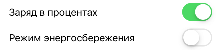
HTML:
<label class="checkbox-ya">
	<input type="checkbox">
	<span class="checkbox-ya-switch">
		<span class="checkbox-ya-feature" data-label-on="Вкл" data-label-off="Откл"></span>
	</span>
</label>

<label class="checkbox-ya">
	<input type="checkbox" checked>
	<span class="checkbox-ya-switch">
		<span class="checkbox-ya-feature" data-label-on="Вкл" data-label-off="Откл"></span>
	</span>
</label>

<label class="checkbox-ya">
	<input type="checkbox" disabled>
	<span class="checkbox-ya-switch">
		<span class="checkbox-ya-feature" data-label-on="Вкл" data-label-off="Откл"></span>
	</span>
</label>

<label class="checkbox-ya">
	<input type="checkbox" checked disabled>
	<span class="checkbox-ya-switch">
		<span class="checkbox-ya-feature" data-label-on="Вкл" data-label-off="Откл"></span>
	</span>
</label>CSS:
.checkbox-ya {
	display: inline-block;
	height: 28px;
	line-height: 28px;
	margin-right: 10px;
	position: relative;
	vertical-align: middle;
	user-select: none;
}
.checkbox-ya .checkbox-ya-switch {
	display: inline-block;
	box-sizing: border-box;
	width: 76px;
	height: 28px;
	margin: 0 auto;
	position: relative;
	background: linear-gradient(90deg, #FFEB9D 0%, #FFEB9D 50%, #e8e9e9 50%, #e8e9e9 200%);
	background-position: -72px 0;
	background-size: 200% 100%;
	border: 1px solid #bababb;
	border-radius: 3px;
	font-size: 13px;
	color: #000;
	transition: all 150ms ease-in;
}
.checkbox-ya .checkbox-ya-switch:before {
	content: '';
	display: block;
	box-sizing: border-box;
	width: 28px;
	height: 28px;
	position: absolute;
	top: 50%;
	left: -1px;
	text-indent: -100%;
	background-color: #fff;
	border: 1px solid rgba(0,0,0,.2);
	border-radius: 3px;
	transform: translateY(-50%);
	transition: all 150ms ease-in;
}
.checkbox-ya .checkbox-ya-feature {
	position: relative;
	display: block;
	height: 28px;
	line-height: 28px;
	overflow: hidden;
}
.checkbox-ya .checkbox-ya-feature:before, .checkbox-ya .checkbox-ya-feature:after {
	content: '';
	display: block;
	position: absolute;
	top: 50%;
	transform: translateY(-50%);
	transition: all 150ms ease-in;
}
.checkbox-ya .checkbox-ya-feature:before {
	content: attr(data-label-on);
	left: -60%;
}
.checkbox-ya .checkbox-ya-feature:after {
	content: attr(data-label-off);
	right: 8px;
}
.checkbox-ya input[type=checkbox] {
	display: block;
	width: 0;
	height: 0;
	position: absolute;
	z-index: -1;
	opacity: 0;
}
.checkbox-ya input[type=checkbox]:checked + .checkbox-ya-switch {
	background-position: 0 0;
	border-color: rgba(153,122,0,.5);
}
.checkbox-ya input[type=checkbox]:checked + .checkbox-ya-switch:before {
	left: calc(100% - 27px);
}
.checkbox-ya input[type=checkbox]:checked + .checkbox-ya-switch .checkbox-ya-feature:before {
	left: 13px;
}
.checkbox-ya input[type=checkbox]:checked + .checkbox-ya-switch .checkbox-ya-feature:after {
	right: -60%;
}

/* Hover */
.checkbox-ya input[type=checkbox]:not(:disabled) + .checkbox-ya-switch:hover:before {
	border-color: rgba(0,0,0,.6);
}
.checkbox-ya input[type=checkbox]:not(:disabled) + .checkbox-ya-switch:hover {
	cursor: pointer;
}

/* Disabled */
.checkbox-ya input[type=checkbox]:disabled + .checkbox-ya-switch {
	border-color: rgba(0, 0, 0, .1);
	filter: grayscale(70%);
}
.checkbox-ya input[type=checkbox]:disabled + .checkbox-ya-switch .checkbox-ya-feature {
	color: #999;
}

/* Focus */
.checkbox-ya.focused .checkbox-ya-switch:before {
	border-width: 2px;
	border-color: #ffdb4d;
}JQuery:
$(window).keyup(function(e){
	var target = $('.checkbox-ya input:focus');
	if (e.keyCode == 9 && $(target).length){
		$(target).parent().addClass('focused');
	}
});

$('.checkbox-ya input').focusout(function(){
	$(this).parent().removeClass('focused');
});