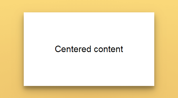
Отцентрованные шаблоны для десктопной версии с фиксированной шириной 960px и прижатым подвалом. Хорошо подходят для лэндингов т.к. есть возможность сделать разноцветные блоки на всю ширину окна.
<!DOCTYPE html>
<html lang="ru">
<head>
	<meta http-equiv="content-type" content="text/html; charset=utf-8">
	<meta name="viewport" content="width=960">
	<title>Title</title>
	<link rel="shortcut icon" href="/favicon.ico" type="image/x-icon">
	<link rel="stylesheet" href="/style.css">
</head>
<body>
	<div class="wrapper">
		<header class="header">
			<div class="wrp">
				<p>Header</p>
			</div>
		</header>
		<main class="content">
			<div class="wrp">
				<p>Content</p>
			</div>
		</main>
	</div>
	<footer class="footer">
		<div class="wrp">
			<p>Footer</p>
		</div>
	</footer>
</body>
</html>html {
height: 100%;
}
body {
width: 100%;
height: 100%;
margin: 0;
padding: 0;
}
.wrapper {
min-height: 100%;
height: auto !important;
height: 100%;
}
.wrp {
width: 960px;
margin: 0 auto;
position: relative;
}
.header {
height: 150px;
background: #B39DDB;
}
.content {
padding: 0 0 100px;
min-height: 200px;
}
.footer {
margin: -100px 0 0 0;
height: 100px;
position: relative;
background: #f7cfad;
}Результат:

<!DOCTYPE html>
<html lang="ru">
<head>
	<meta http-equiv="content-type" content="text/html; charset=utf-8">
	<meta name="viewport" content="width=960">
	<title>Title</title>
	<link rel="shortcut icon" href="/favicon.ico" type="image/x-icon">
	<link rel="stylesheet" href="/style.css">
</head>
<body>
	<div class="wrapper">
		<header class="header">
			<div class="wrp">
				<p>Header</p>
			</div>
		</header>
		<div class="middle">
			<div class="wrp">
				<div class="container">
					<main class="content">
						<p>Content</p>
					</main>
				</div>
				<aside class="leftcol">
					<p>Left</p>
				</aside>
			</div>
		</div>
	</div>
	<footer class="footer">
		<div class="wrp">
			<p>Footer</p>
		</div>
	</footer>
</body>
</html>html {
height: 100%;
}
body {
width: 100%;
height: 100%;
margin: 0;
padding: 0;
}
.wrapper {
min-height: 100%;
height: auto !important;
height: 100%;
}
.wrp {
width: 960px;
margin: 0 auto;
position: relative;
}
.header {
height: 150px;
background: #B39DDB;
}
.middle {
width: 100%;
padding: 0 0 100px;
position: relative;
}
.middle:after {
display: table;
clear: both;
content: '';
}
.container {
width: 100%;
float: left;
overflow: hidden;
}
.content {
padding: 0 0 0 260px;
min-height: 200px;
}
.leftcol {
float: left;
width: 240px;
margin-left: -100%;
position: relative;
min-height: 200px;
background: #ED6492;
}
.footer {
margin: -100px 0 0 0;
height: 100px;
position: relative;
background: #f7cfad;
}Результат:

<!DOCTYPE html>
<html lang="ru">
<head>
	<meta http-equiv="content-type" content="text/html; charset=utf-8">
	<meta name="viewport" content="width=960">
	<title>Title</title>
	<link rel="shortcut icon" href="/favicon.ico" type="image/x-icon">
	<link rel="stylesheet" href="/style.css">
</head>
<body>
	<div class="wrapper">
		<header class="header">
			<div class="wrp">
				<p>Header</p>
			</div>
		</header>
		<div class="middle">
			<div class="wrp">
				<div class="container">
					<main class="content">
						<p>Content</p>
					</main>
				</div>
				<aside class="rightcol">
					<p>Right</p>
				</aside>
			</div>
		</div>
	</div>
	<footer class="footer">
		<div class="wrp">
			<p>Footer</p>
		</div>
	</footer>
</body>
</html>html {
height: 100%;
}
body {
width: 100%;
height: 100%;
margin: 0;
padding: 0;
}
.wrapper {
min-height: 100%;
height: auto !important;
height: 100%;
}
.wrp {
width: 960px;
margin: 0 auto;
position: relative;
}
.header {
height: 150px;
background: #B39DDB;
}
.middle {
width: 100%;
padding: 0 0 100px;
position: relative;
}
.middle:after {
display: table;
clear: both;
content: '';
}
.container {
width: 100%;
float: left;
overflow: hidden;
}
.content {
padding: 0 260px 0 0;
min-height: 200px;
}
.rightcol {
float: left;
width: 240px;
margin-left: -240px;
position: relative;
min-height: 200px;
background: #ED6492;
}
.footer {
margin: -100px 0 0 0;
height: 100px;
position: relative;
background: #f7cfad;
}Результат:

<!DOCTYPE html>
<html lang="ru">
<head>
	<meta http-equiv="content-type" content="text/html; charset=utf-8">
	<meta name="viewport" content="width=960">
	<title>Title</title>
	<link rel="shortcut icon" href="/favicon.ico" type="image/x-icon">
	<link rel="stylesheet" href="/style.css">
</head>
<body>
	<div class="wrapper">
		<header class="header">
			<div class="wrp">
				<p>Header</p>
			</div>
		</header>
		<div class="middle">
			<div class="wrp">
				<div class="container">
					<main class="content">
						<p>Content</p>
					</main>
				</div>
				<aside class="leftcol">
					<p>Left</p>
				</aside>
				<aside class="rightcol">
					<p>Right</p>
				</aside>
			</div>
		</div>
	</div>
	<footer class="footer">
		<div class="wrp">
			<p>Footer</p>
		</div>
	</footer>
</body>
</html>html {
height: 100%;
}
body {
width: 100%;
height: 100%;
margin: 0;
padding: 0;
}
.wrapper {
min-height: 100%;
height: auto !important;
height: 100%;
}
.wrp {
width: 960px;
margin: 0 auto;
position: relative;
}
.header {
height: 150px;
background: #B39DDB;
}
.middle {
width: 100%;
padding: 0 0 100px;
position: relative;
}
.middle:after {
display: table;
clear: both;
content: '';
}
.container {
width: 100%;
float: left;
overflow: hidden;
}
.content {
padding: 0 260px 0 260px;
min-height: 200px;
}
.leftcol {
float: left;
width: 240px;
margin-left: -100%;
position: relative;
min-height: 200px;
background: #f06291;
}
.rightcol {
float: left;
width: 240px;
margin-left: -240px;
position: relative;
min-height: 200px;
background: #f06291;
}
.footer {
margin: -100px 0 0 0;
height: 100px;
position: relative;
background: #f7cfad;
}Результат: